Newton died, read about part 2 here or part 3 for the latest.
This post has now been updated to reflect my decision. If you’ve read through before, jump down to see which I chose. If you haven’t, don’t spoil it…read on.
Email. Everyone gets it. Everyone has to read, sort, reply, and deal with it. It’s a part of our life. I think perhaps my Grandma is the only person I know that doesn’t use it. Of course she’s 91 years old and has never used a computer.
I’ve used the default mail app that comes with Mac and iPhone for a long time now. I’ve always liked having a native mail app. I’ve tried a few here and there but for some reason or another always came back to Mail. Sometimes it’s slow and while it’s not the most beautiful app out there it’s familiar and I can trust it.
I recently reformatted my mid 2012 Macbook Pro (which still runs like a champ) and decided to evaluate my apps and this included my mail app. Here’s a short run down of how that went.
Airmail
Airmail was the first I tried. It’s been out for a while, I’ve heard a lot about it, and I’ve almost downloaded it a number of times in the past. Here’s the view after the easy initial account setup.
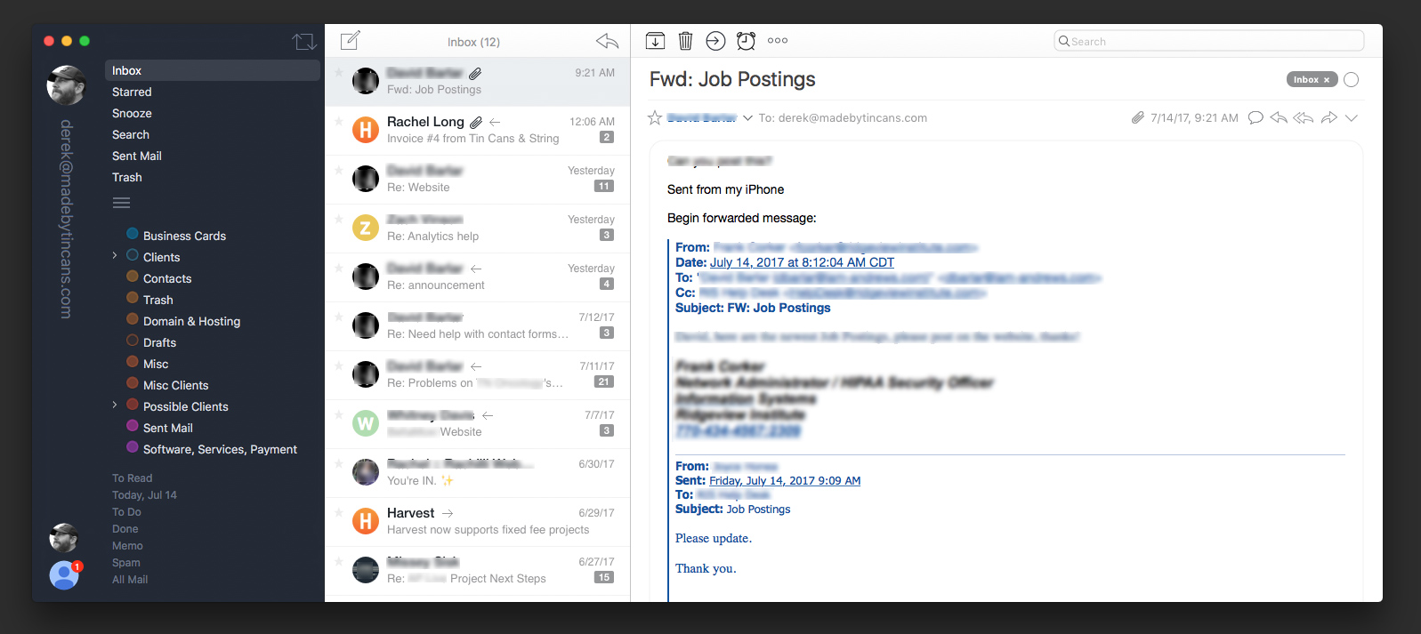
After I tinkered with it a bit I landed on a view which removes the avatars from the sender, the lists under the folders, and other small things. It’s called “Pro Slim” in their list of themes.
Other than that, out of the box Airmail seemed pretty setup. The design is a step up from Mail.app for sure (Apple Design Award 2017 Winner). It has templates and a send later option which are two features, beyond design and ease of use, I’m looking for.
Cost: $10 which is more than fair.
Pros: Modern design, handles multiple accounts well, send later, templates, works great with Google accounts
Cons: Small design changes could make this even better. I don’t care for the massive avatar and email address (which you can change to account description) on the left hand side. I know who I am. The icons at the top also feel a bit large and cluttered.
Bottom line: Airmail could easily replace Apple Mail app for me. In comparison to the others design-wise it seems like the “cool kid”. I don’t really see any issues functionality-wise.
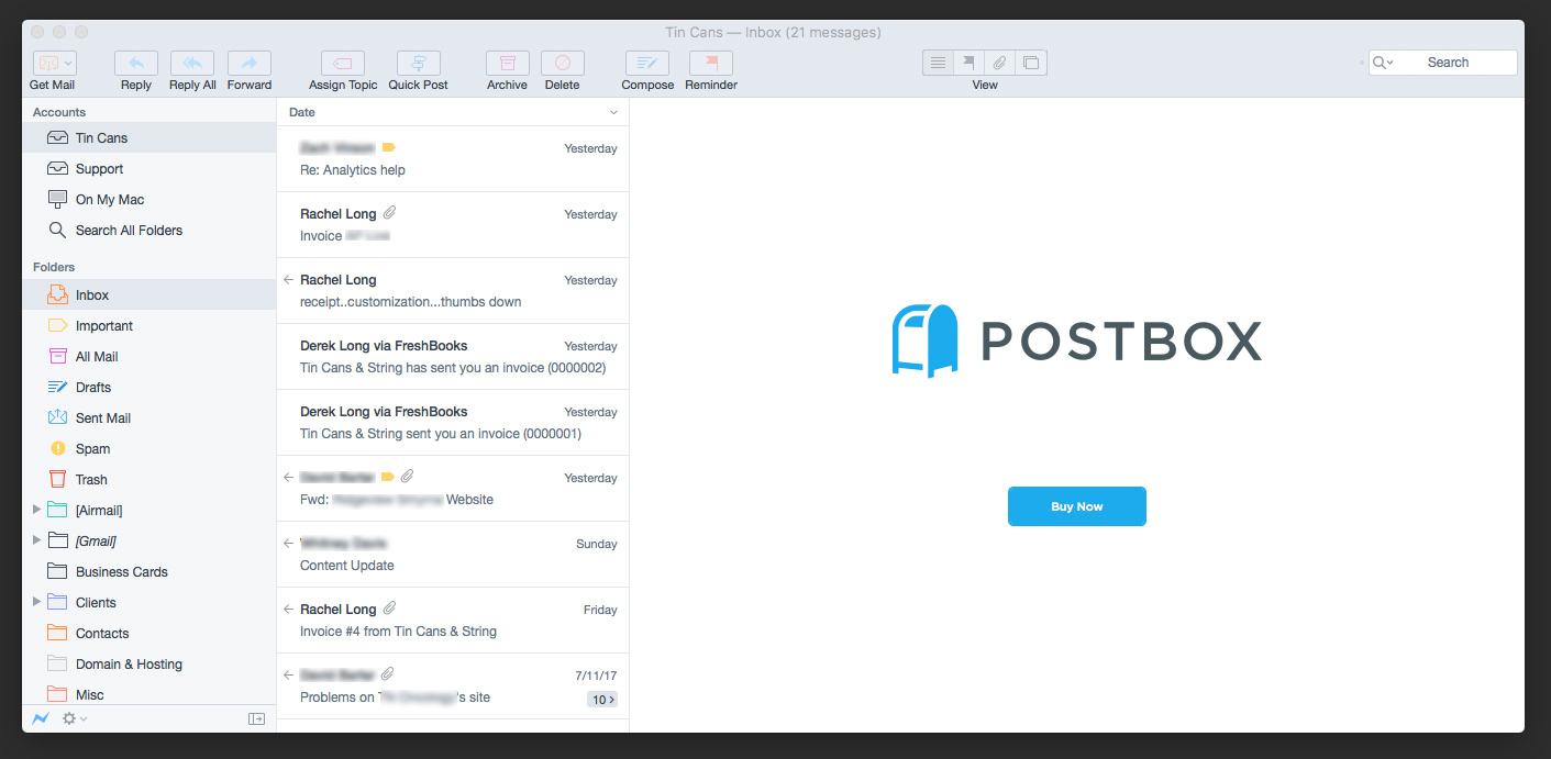
Postbox
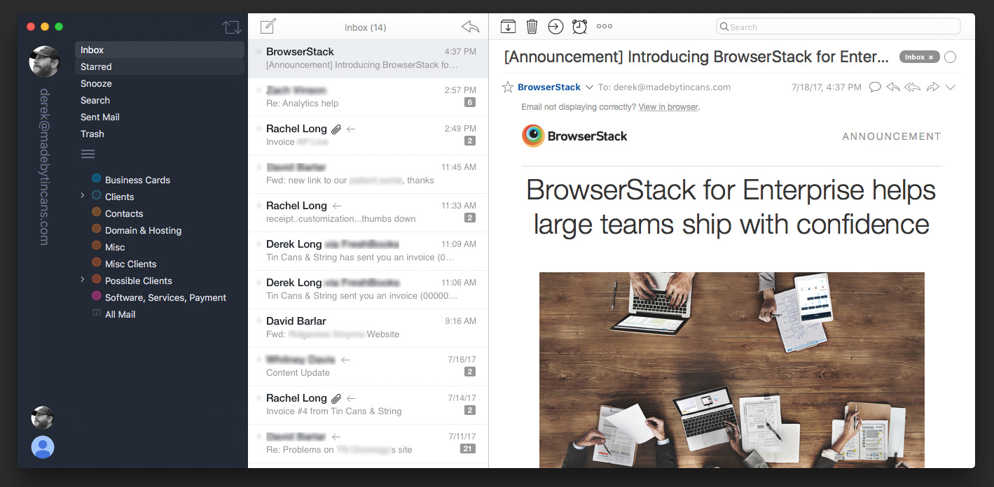
Postbox claims that there are “the power email app for busy professionals”. I’m unsure how busy or professional I am but figured I’d give it a shot. The app seems geared towards the work crowd more so than Airmail which worried me a bit because typically those products focus less on design. I was pleasantly surprised.
As an Apple Mail user it’s very familiar, better designed, and has the missing features that Mail lacks. I like that it feels a bit more professional than Airmail, but that’s just my opinion.
Cost: $40
Pros: Solid familiar design, handles multiple accounts well, send later, templates, works great with Google accounts. I contacted them on twitter and they had a great response time.
Cons: Initially I couldn’t figure out how to get the important tag that Gmail puts on everything off of the emails. None of the other mail apps did this or I’d say this is Google’s problem, but after removing it from a few contacts I think in time it will fix itself. I couldn’t remove the On My Mac mailbox which is weird and not preferable. I also noticed that some email marketing emails I get horizontal scroll which I asked Postbox about. The same email in all other email clients displays just fine.
Bottom line: Postbox is basically a better designed Apple Mail with more features but I’m a bit concerned with the few quirks I’ve found in a short period of time.
Newton
Simple. Beautiful. Reliable. That’s their tagline and they are completely right. This app feels simple and easy to use much like Dropbox Paper. (I love Dropbox Paper. If you haven’t used it, give it a spin.)
Yep, that’s it. Whatever familiarity you have with email apps, just throw that out the window when you use Newton. It feels completely different. There’s no clutter which allows you to focus more. It has a sidebar but not one you can always show. Instead you can use hot keys (or icon click) to swap between accounts or it’s subtle icons with dropdowns to move mail into folders.
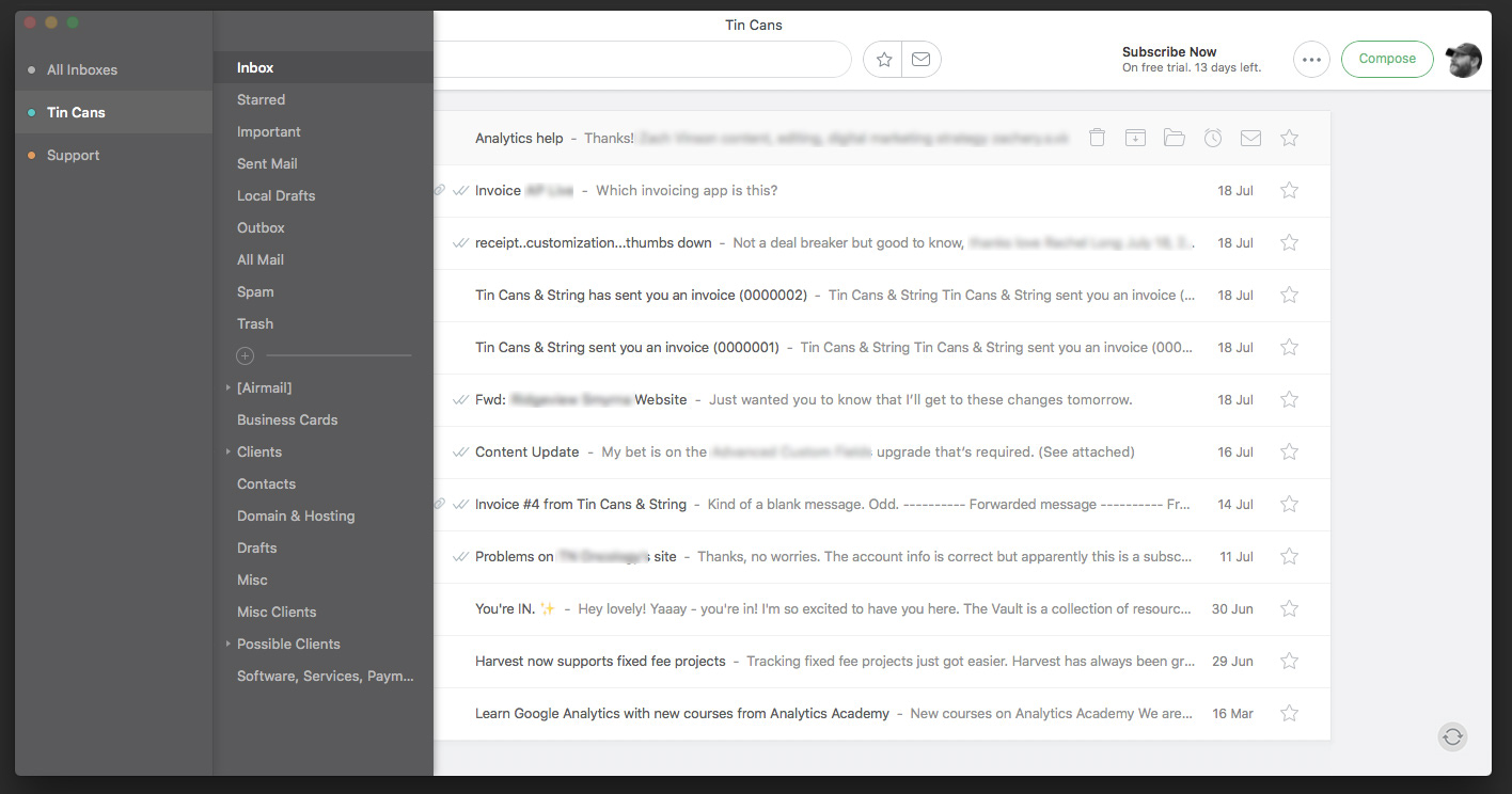
The slide in sidebar view
There are very few options for Newton, but I’m not turned off by that. Well designed apps that focus on doing a few things right, as long as it’s the right few things, are more appealing than an app that tries to do everything. Think of Dropbox Paper vs. Google Docs.
Since Newton is a bit different here are a couple more screenshots:
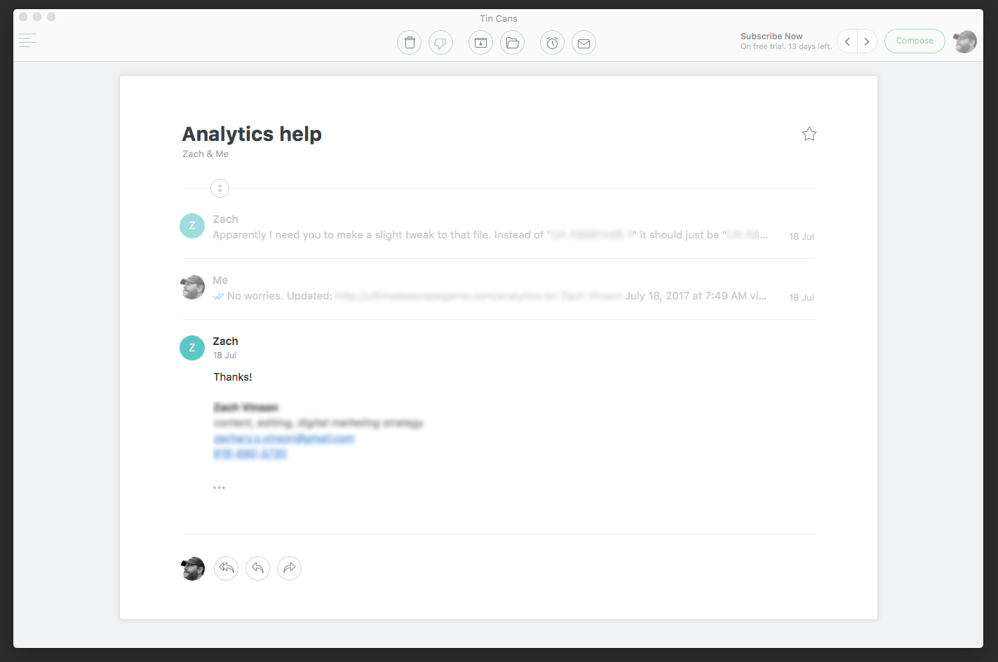
Newton’s view when reading a message
As you can see, there’s a way to click back and forth to the next message (top right left and right arrows) but there is no way to view the email you are currently reading along side a list of other emails in a split screen view, something we’re all so accustomed to. You also can’t make use of any drag and drop features which I use all the time to move emails into folders. Instead you accomplish these actions by clicking or using hotkeys. Oh and to return to your list of email after reading your message you simply press escape.
Probably my favorite part of Newton is this beautiful, simplistic compose message popup which, again, reminds me of Dropbox Paper. Talk about a focused view. This same view is also shown when you reply to a message.
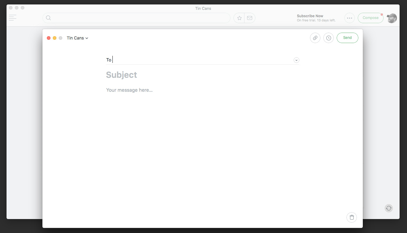
Newton’s compose new message
So that’s Newton, pretty different eh? I feel like if it was just a different designed mail app like Airmail or Postbox my choice would be much easier.
Cost: $49.99/year. Yep, $50 a year to read your email. To some this is a deal breaker, but if I didn’t care about design or my apps I’d be pecking away on a Windows machine checking mail with Outlook and this wouldn’t be a post. I don’t mind investing in an app that gives me a beautiful design and makes my life a bit easier. If I rely heavily on an app I have no problems supporting it’s continued development to ensure the company stays in business and that they see updates as a priority. (How many apps have you relied on that are no longer maintained or have since shutdown?)
Pros: Their tagline is spot on. Newton really is beautiful, simple, and reliable. I’ve only used this for a short time period but I think this app is one that could totally change how you look at and deal with email. The read receipts are a nice touch as well, no more “please respond if you get this email” lines. Newton sends a nice set of drip onboarding emails asking how it’s going (a real person replyed and helped) and also sent a 20% discount (expires in 24 hrs).
Cons: No templates. I’m unsure how this featured missed the boat but it did. Habits are hard to break. No more drag and drop and no more split screen means I feel a bit lost. I’d really have to totally buy into this new way of handling my email. It feels lacking, but that’s likely because I’m use to looking at 3 panes at once (folders, list of email, email reading) and going through email that way. Looking at such a focused view I feel like I don’t see the whole picture of my inbox, perhaps a good thing but very different. I also should note that you have to sign up for an account with Newton and I don’t think there was a way around this in the setup. Also I just noticed that even with the app closed it still checks email.
Bottom line: This may be all I need, but I’m not sure yet and if I buy in then it may feel very weird going back to another email app.
Apple Mail
Sure, let’s throw Apple Mail up here since it’s the standard of my comparisons. I don’t have much to say because I feel like if you’re a Mac user then you’ve at least tried it at some point. Here she is…
Apple Mail in all of it’s lackluster glory
I don’t think much has changed as far as design or options with this app since I started using it around a decade ago. Up against these other guys you can really feel how dated it’s design is.
Cost: Free with Mac OS.
Pros: Get’s the job done and keeps me out of the browser (Gmail).
Cons: No templates, far from beautiful, can’t schedule to send later, and has been slow in the past but performance has improved with newer operating systems.
Bottom line: It works.
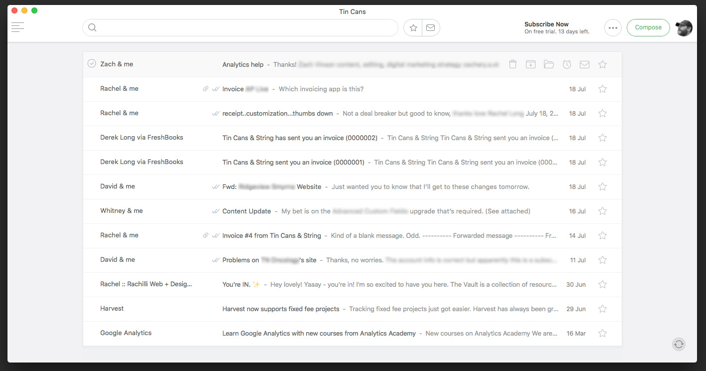
Inbox
Apparently Inbox by Gmail is an option (if Google handles your mail) that I wasn’t aware of as I thought it was only for mobile. It’s only in the browser but if you gotta have an app it looks like someone has developed it. The design feels like what Gmail should be and as for it’s features, eh I probably won’t dive in too much as I think for me any other app on this page is preferable. It’s probably a good solution for someone who uses Gmail in the browser though.
Which to Choose
So you are probably wondering, which did he pick?!?! At this point I’m still trying them all. The designer in me wants to use Newton but the practical side is telling me to stick with what works or go for Postbox if it proves to do it’s job.
I’ll let you know when my trials are up. In the meantime if you’ve used any of these apps let me know what you think!
Update 7/21
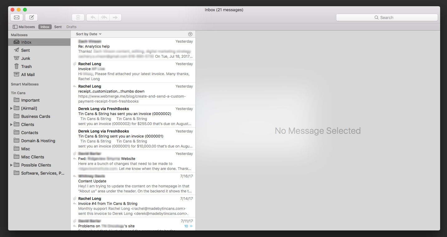
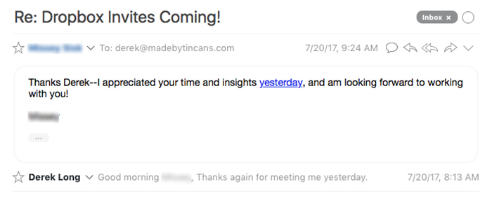
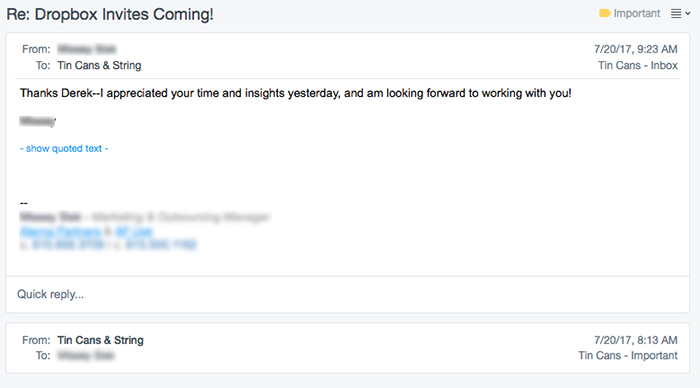
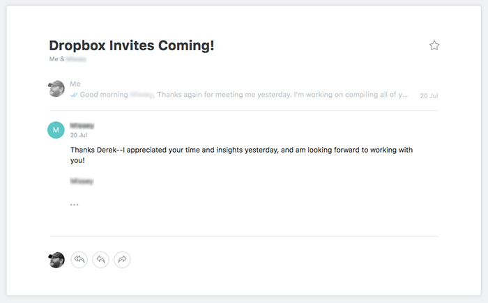
In going back and forth between these four apps I noticed the difference in how each of them vary when reading email. It also makes me wonder how people are viewing the emails I’ve sent from Apple Mail for years. (Something I haven’t worried about since I stopped coding html emails faster than I started.) Here’s the same email in each app:
Airmail read message
Postbox read message
Newton read message
Apple Mail read message
As you can see the way each handles reading email is a bit different. I like that by default Airmail, Postbox, and Newton all have a collapsed view of my original message to my client while Apple Mail shows the entire message. Both Airmail and Newton seem the most similar here as both put more focus on the subject of the email and have a small preview of my original message. The date and time are handled a bit different as well. Both Airmail and Postbox show date and time, Apple mail mentions “Yesterday” with the time, and Newton only shows the date (time can be shown with an extra click). There’s other small differences but thought I’d point out a few to compare.
Update 7/26 – Final Decision
You knew it was coming didn’t you? Yep, I went with Newton. I did so for two simple, very important reasons: it’s beautiful and it works. Having one of those without the other doesn’t cut it, you have to have both.
After I wrote the bulk of this article I went back and gave each another try for a time, but kept going back to Newton. It really does change how I handle email. The experience and design of this app did hold a lot of weight in my decision but it also performs better than the other apps. The other apps either had a design or functionality quirk that turned me off, but with Newton everything is a joy to use.
The 20% off discount I mentioned above had expired by the time I made my mind up so I contacted Newton through one of their onboarding emails and they happily enabled it again for me. I was pleasantly surprised to find out that I get that discount every year, not just the first.
After I bought the app it dawned on me I hadn’t tried the mobile version yet. So I downloaded it on my phone, signed in using my Newton account, and it immediately pulled in all of my email accounts. Easy enough. No setting up 4 accounts again (work + personal) and they stay in sync across my devices perfectly. And yes, it’s just as nice as the desktop version.
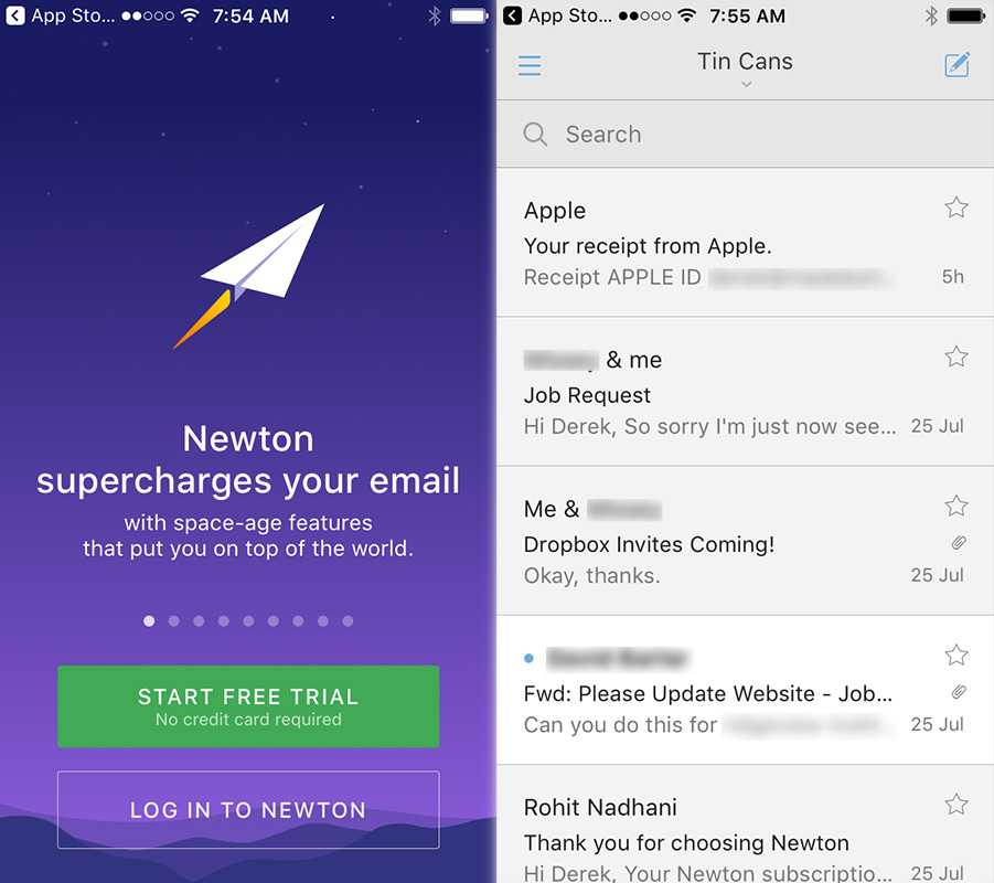
Newton Mobile’s login screen and inbox
So there you have it. I finally jumped ship from Apple Mail. Thank you Mail for all your hard work over the years, but Newton can handle it from here.
Hi, I stumbled across your blog while searching about mail apps for Mac. I like the way you went great length into details and aesthetic look of each. I almost fell for Newton too with its simplistic design, except for its hefty yearly price tag, for something that you can gain alternatives for free.
I am considering between Mail App and Postbox. The lifetime license does the trick. Do you think I should make the leap and switch to Postbox?
Your reply is highly appreciated. Tks
Hey Johnny! Thanks! I’ve been using Newton since the time of this post and I really enjoy it. I’m always reluctant, as you’ve pointed out, to buy something that I can get for free/cheaper as well but if it makes my life a bit easier I’m all for it. Paid apps also help the developers implement more features and ensures the app will survive over time.
As for Postbox, it would’ve been my choice most likely if I hadn’t found Newton. Coming from Apple mail it was basically an improved version of that.
You may also be interested in Spark (https://sparkmailapp.com/). It’s one that I haven’t tried but have heard good things.
Best of luck!
What are you doing now that Newton shut down?
Hey Bek, thanks for asking.
I evaluated another round of email apps here:
https://iamdereklong.com/battle-of-the-mail-apps-again/ where I chose Astro. But now Astro is shutting down as well so I made this post yesterday: https://iamdereklong.com/battle-of-the-email-apps-v3/ in which I’m currently only using Apple Mail with a customized view.