
October 9, 2018 Update: Astro shutdown, Read part 3 for the latest.
Well, this happened. Go read it real quick. I’ll wait.
You didn’t read it did you? That’s fine, basically, the best email app on the market, Newton, will no longer work after September 18th, 2018 due to profitability.
“It was a tough business decision. We explored various business models but couldn’t successfully figure out profitability & growth over the long term. It was hard; the market for premium consumer mail apps is not big enough, and it faces stiff competition from high quality free apps from Google, Microsoft, and Apple. We put up a hard and honest fight, but it was not enough to overcome the bundling & platform default advantages enjoyed by the large tech companies.”
I gladly pay for apps to ensure longevity, but it doesn’t always work out. It’s interesting if you read the comments on that Medium post or the comments on their Twitter. People are sad to see it go, but yet people still complain that they had to pay for it. Mind-boggling.
This app really helped me tackle email and it’s a shame we’re losing it but we move on.
Let’s try this again
So once again here I am struggling to find a decent email app. This time the bar is set much higher, the bar is Newton. In my previous post I went through Airmail, Postbox, and Apple Mail, for kicks, so at least I don’t have to sort through those again. I thought about just throwing in the towel and using Google Mail’s interface (the new Gmail or Inbox) or just reverting back to Apple Mail but figured I’d give it a shot first.
I’m going to test them all for at least a day and add my thoughts on each. Here’s a quick list and a screenshot of each of the apps I’m currently trying. I’m not going as in-depth as I did last time, only some quick comments. If you have questions, feel free to ask.
Astro
This was recommended by a guy on Twitter (thanks Myke!) after Newton’s announcement. It has an “email assistant” that supposedly uses machine learning to help with some task but I’m not quite sure how valuable that is to me. Aside from that, it seems to do all the things I would need.
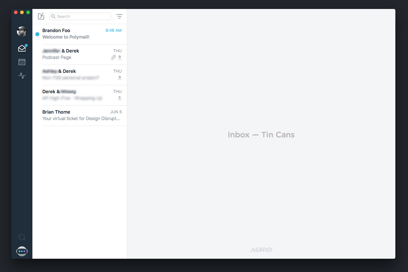
Cost: Free
Pros: condensed sidebar with hotkeys to cycle through accounts, all the features I need, clean UI, compose and reply screens are clean (show/hide the formatting bar), on undo send it shows the email again instead of hiding it in the drafts like the others
Cons: Being free is a concern. I don’t need a calendar inside my email app, at least I don’t think so, and there should be a way to turn this off. Although you can change the font, it needs more line height on the type when reading emails.
Spark
This is one of those team apps, but you don’t have to use those features. One thing that was a bit odd was that your folders are nested inside the “more” sidebar item. That’s not necessarily a bad thing, but I’m just familiar with seeing a list in that area.
I found this issue when I was replying that the app would lag. I think the reason is due to the way it creates real-time drafts at the bottom of the main window (as you type words appear on screen). This particular email has several replies with some lengthy content.
Cost: Free without a team, $6.39/user with
Pros: Clean view with option to remove items from the sidebar (bye bye pins, archive, shared), good UI, likely the best readability of the bunch when reading and composing, has a calendar but you can turn it off, nice clean reply screen
Cons: Inboxes are nested under the inbox dropdown in the sidebar because of the overall/one inbox feature (which I don’t use on any app). No hotkeys for jumping between different accounts. No hotkey for undo send that I can find (so if you forget something you better move that mouse quick). I guess there aren’t read receipts? The performance issue with replying. Also concerning that I never got an onboarding email from Spark or a reply to my tweet.
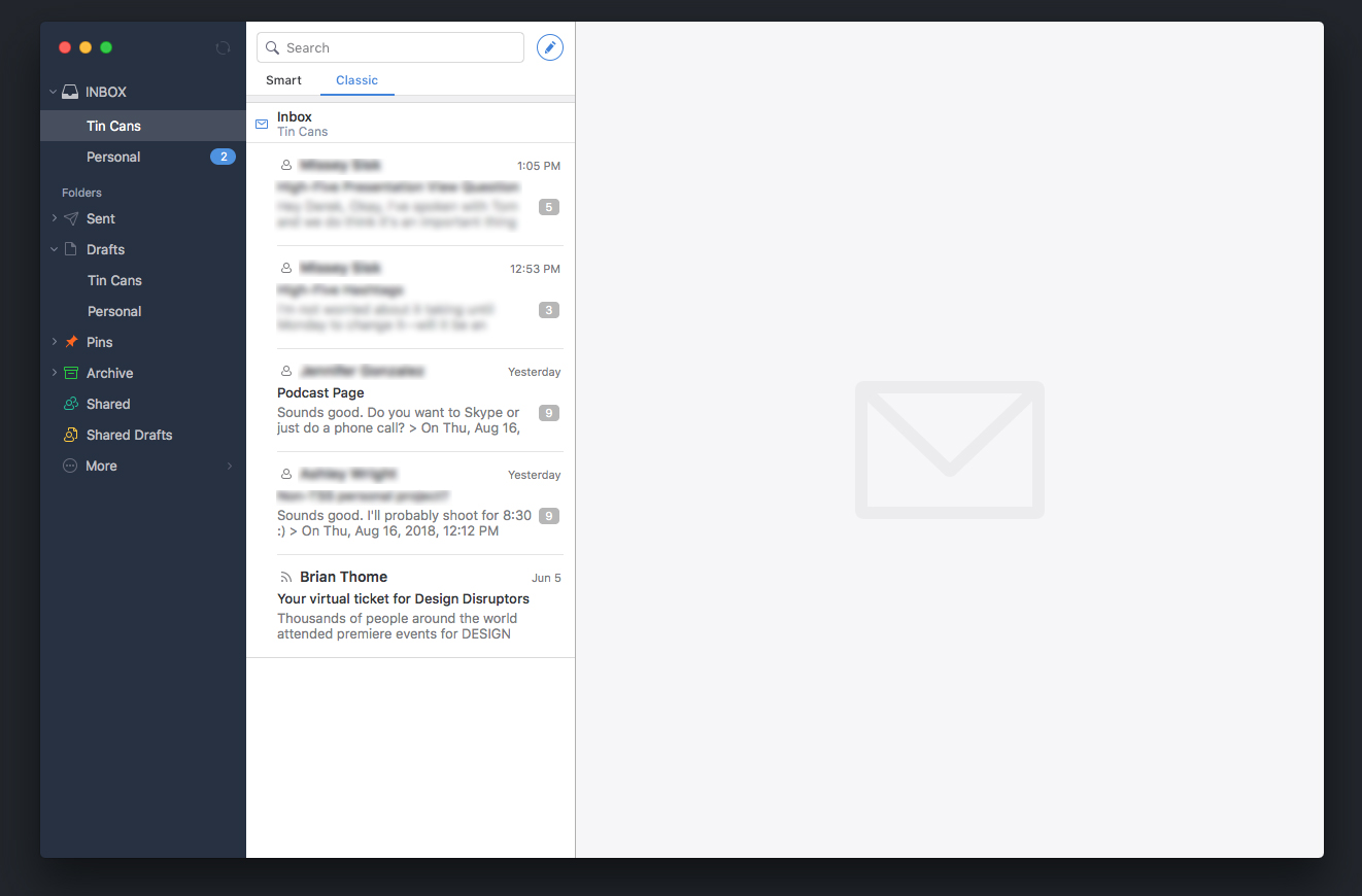
Polymail
Another team email app, but again you don’t have to use it as such. Visually similar to Spark on this first screen. This, as well as others, is actually a web app so you can get this same view in the browser. Although because of this, their preferences panel is inside this same screen as opposed to a new window which is really annoying for initial setup and testing options.
After more use, I think the team features really are a core part of this app more than the other team apps. To the point where they sort of take over the app at times. While I’m sure they are very nice for teams, I don’t need those, and it degrades the experience for the single user. If there was an option to turn some of those off that would really help.
Cost: $10/user/mo for the base plan
Pros: great opening screen design, has all the features I’d want
Cons: I can’t remove the team feature from the sidebar and I also can’t remove the small right sidebar. Compose and reply screens are pretty ugly (who needs a WYSIWYG toolbar?). The main focus on a reply is to make a comment to your team instead of replying to the email. No way to navigation to different inboxes with a hotkey. For some reason, there’s a count beside all of my inboxes and it seems to be related to how many emails are in my inbox. For all these reasons the UI feels a bit cluttered and feels more focused on the team than I need.
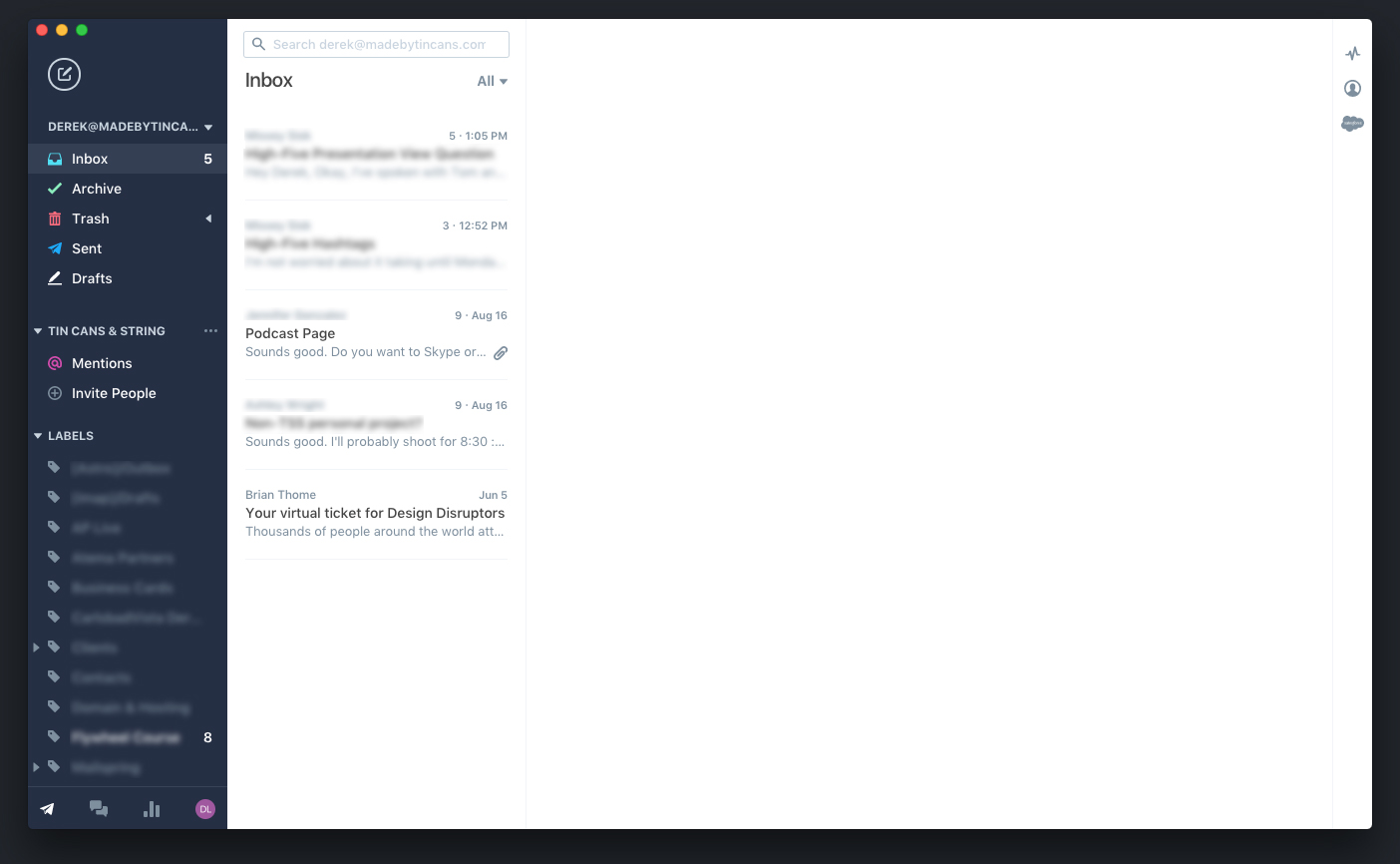
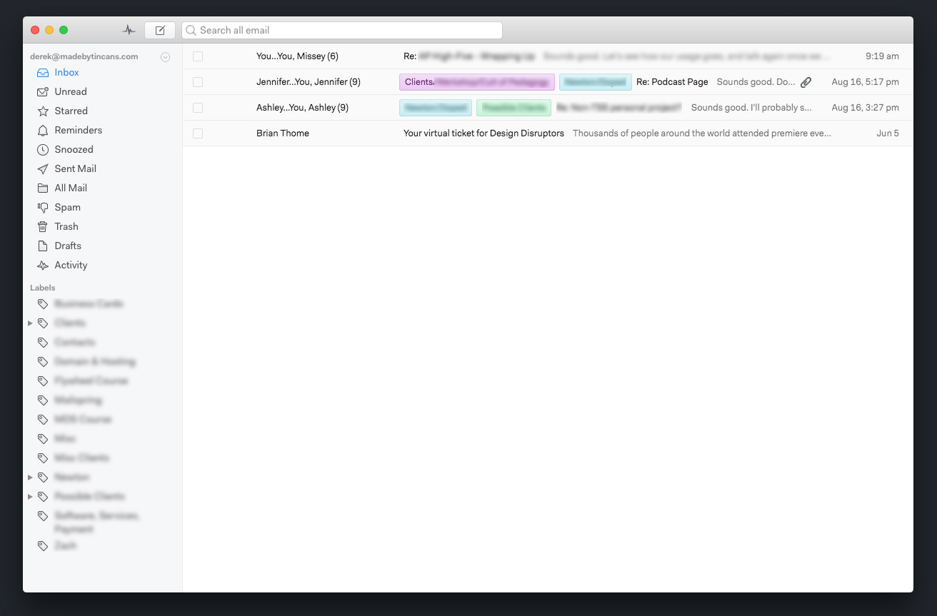
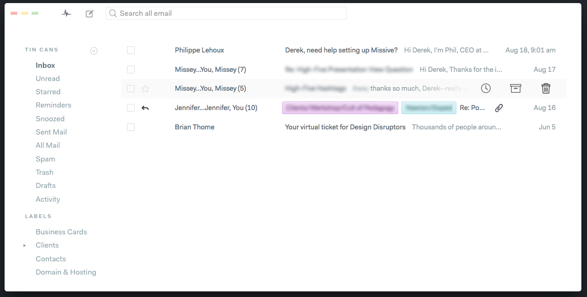
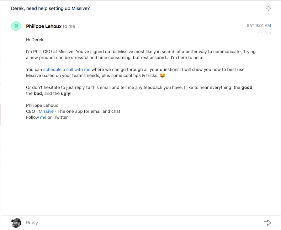
Missive
As soon as I opened this app I thought this was the one. The screen view you see below is clean, simple and breathes well. Unfortunately, it sort of goes down kill for me from there. This app is really close but man why do so many email apps not provide an enjoyable reading experience? That’s half of the whole point of email! By the way, this is another team email app.
I noticed something really strange. Not only did the order of my inbox emails not match my other email apps but I was missing an email. I think I figured out that the order of my inbox seemed to be related to how I interact with the messages. For example, if I drafted a reply then discarded the draft, that email would be at the top of my list. Kinda odd. As for the missing email, I’m unsure about that one. It’s an old email (2.5 months) but it’s not there. You can even see this if you compare my screenshots. This is a big red flag. If I can’t trust this client to pull my emails, it’s not a good solution.
Cost: Free for 5 accounts, $8/mo
Pros: great design on the main screen, has the features I need, you can hide sidebar items you don’t need, compose screen is clean, line height option for composing
Cons: Read screens are cluttered with lines and boxes, type needs improvement (like others), same issue as Polymail with the main reply focus being a comment instead of actually replying. Like Polymail it’s a web app so the preferences screen, which isn’t well designed, blocks your view of the app while trying to customize. An issue with not pulling all my email and changing the order of emails in my inbox.
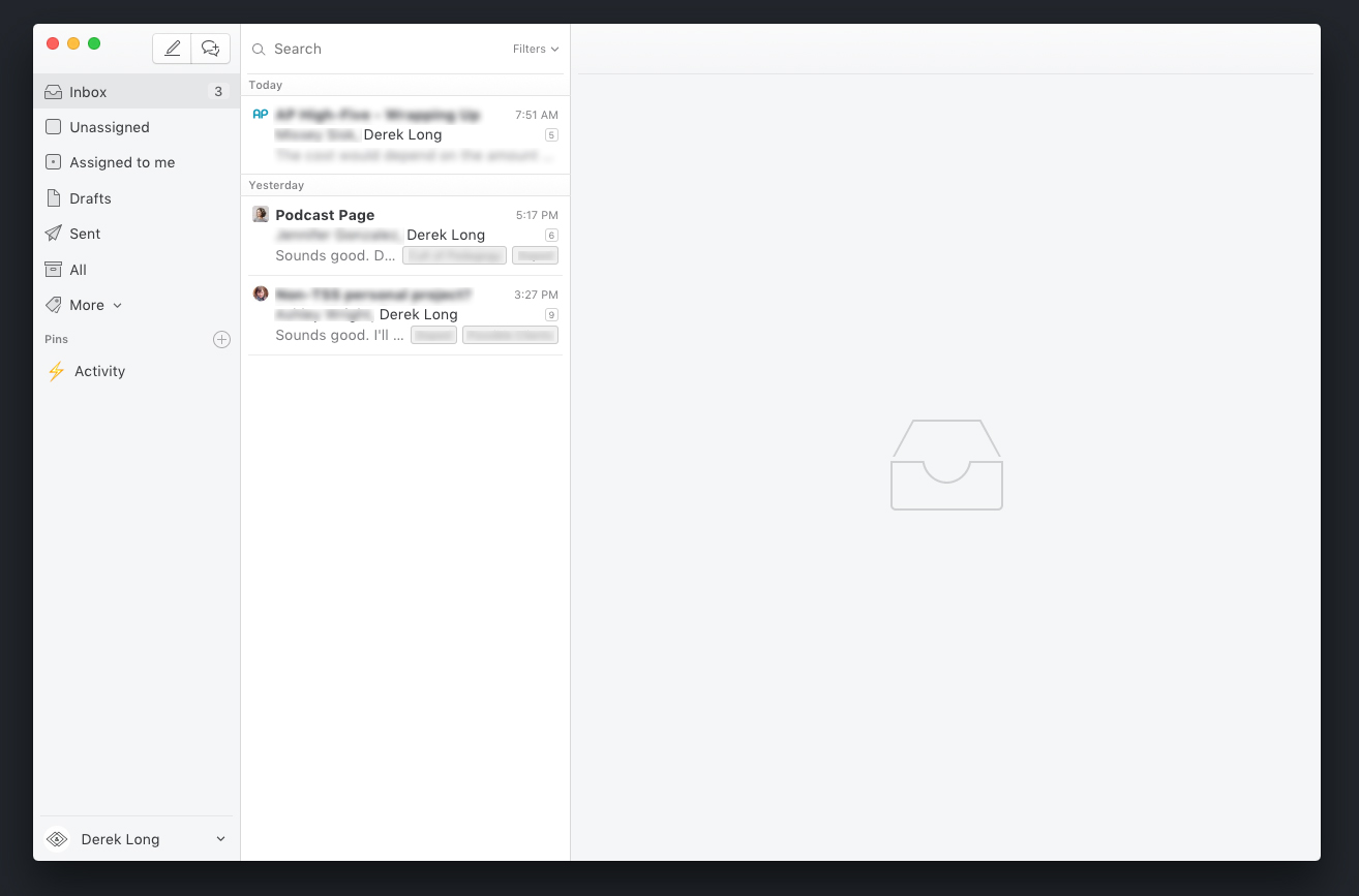
Mailspring
Much like Missive, I liked the clean look. This is the only one out of the group that has the 2 column view (with an option for 3). Although a hotkey or way to toggle the sidebar for a single column view would be even better. Mailspring has themes you can choose from or you can build your own. Going Pro gives you templates, read receipts, link tracking, send later, follow-up reminders, and detailed contact profiles. I also want to mention that they send you some onboarding emails which I appreciate.
main screen using the default theme
the “less is more” theme (a touch too minimal)
focused reading screen using the “less is more” theme
a fixed height reply screen feels cramped
Cost: $8/mo for what I’d want, free for fewer features
Pros: It has an option to scale the UI and with it comes better readability due to extra padding and line height (this may be the saving grace), create your own theme (complete with a developer mode), toggle through accounts with hotkeys, seems to have the features I’d need
Cons: Parts of the design feel fresh but others a bit dated. With a better design, you wouldn’t have to create your own. If I do use this app I’ll likely be spending some time doing that. The reply screen feels cramped and while you can pop out into a separate window it’s an extra click every time.
Notes
One thing I noticed is that most apps handle the undo send option a bit odd. The undo send happens but then you don’t see the email anymore. You’d think they’d keep the email on screen (Newton does this…sigh) or at least a little visual cue to say “hey it’s here in the drafts/outbox”. It’s almost as if they treat undo send as a delayed save draft. Astro was the only one that didn’t do this. They handle it just like Newton did.
The unified as well as the priority inbox is of no use to me. The point of it is clear but I have different email addresses to create separation. I’d be curious how others use it. It must be popular because it’s listed as a feature. Props to those that allow me to either turn this off or those that do not make this such a must use feature.
The different ways to handle email threads seems to be to either some show them all or some show the last one with a condensed view of the others. I prefer the condensed view but also want to quickly be able to see how said what and what each email was about so I can refer back. I like that some will condense the name, so instead of Derek Long they’ll just say, Derek. I also like that some have avatars. Astro and Mailspring had great views here and Spark was the worst at this.
I was going to try Boxy and Canary but they don’t have trials. I’ve heard good things about Edison but it doesn’t seem to have a Mac client.
Decision
I’ve decided I’m going with Astro. It’s really the only one that didn’t turn me off or have some issue I couldn’t get past. The features of all of these are very similar if not identical so it mostly came down to design. If you didn’t read any of the above here’s my take on each:
Spark is really close to being what I need but it doesn’t have read receipts and has a performance issue with long threads. When Spark lagged when I was writing an email, and I tested several times since, that was the end for that one.
Polymail is a team email app. They even say it on their home page so it may not have been fair to try to compare here. If you are on a team I can see how this would really change how you use email.
Missive seems like it’s perhaps just getting started. This app may be good if they clean up the UI and readability. It didn’t feel as polished as the others.
Mailspring is somewhat similar to Missive in its design and lack of polish. The design just isn’t there yet. I like the idea of the developer mode but I also just want it to look nice. I’d have to really get in there and change a lot to make the UI work for me. I love CSS but not enough to fix the app.
Why Astro?
Astro was simply the clear winner. It would’ve been close if either Polymail had the UI and readability of Spark, or if Spark didn’t have that performance issue. Astro was an easy choice after I tested them all.
Astro has the best reply screen hands down. It’s not cluttered, it’s the main action (as opposed to the team apps), and the animation is very smooth. You have the option to pop out the reply if you’d like and that view is also clean.
reply screen animation
Astro’s design is balanced. Missive and Mailspring felt too minimal, and not designed well, and Polymail felt a bit too heavy. Astro strikes a nice balance.
Astro is easy to navigate. I’m not a big shortcuts person but having shortcuts to expand the sidebar, jump between accounts, reply, send, compose, etc. really helps. Those seem basic but not all of the apps did this. The limited use of icons and options also helps. Some email apps give you an entire row of options at the top of every email.
Do I need these?
Here are a few things I’m not sure if I need or will use, but willing to try:
- Calendar – Several apps have this feature and Astro claims it’s so you can quickly add events, see snoozed items, and reminder emails. Either way, be nice to remove this from the sidebar, other apps had this option.
- Astrobot – it can send you updates to slack, read emails for you, add things to the calendar, etc.
- Insights – this seems more like a notification type system within the app but it basically tells you what’s up. “Bob just opened your email” type things plus Astrobot notifications.
Ways to Improve
My wish list is fairly short, but here are some things that I would like to see:
- Line Height – Did I mentioned better readability yet? Add some line-height to the read, reply, and compose screens and I’ll be happy. Take a cue from Newton or Dropbox, beautiful apps to read and write in.
- Don’t Die, Keep Updating – This is a big one. They mentioned that they are building an enterprise version with a focus on teams but I hope that this version of the app continues to improve.
- Single Column View – I really enjoyed the focused, single column view of Newton. This is more than a design preference, I think it helps you focus on your inbox (or any folder) and creates a calming experience.
- Templates – I’ve lived without them, but they would save me some time.
- Insights removed from Inbox – I’m unsure if this is a preference I haven’t found, but removing the insights from the inbox and only having it within the insights view would be preferred.
Well, that’s it. Astro is the app for me. Farewell Newton. It was great while it lasted.
I tried (i.e. had to buy) Boxy 2. The first sign of alert, which I ignored is that they are making a wrapper for Google Inbox that will come out in the next few months and that they say is the next version of Boxy.
But the main problem for me was:
1. It requires that the admin of the G Suite account you are connecting to, to enable Google Inbox, which is not there by default (this was a no-no for me because I can’t ask employers or clients to do that)
2. It does not show all accounts in one inbox, you have to toggle through them.
Have you considered Postbox (https://www.postbox-inc.com/)?
I just wish there was a well designed, single column (I don’t need all that extra noise), multi-account, without all the bells and whistles (I only use the snooze, not the read receipts or others).
Having Argo read all my mail to decide on it is something that does not excite me at all, but I’ll give it a shot.
Thanks for the article, super useful!
Hey Miguel,
Thanks for the info about Boxy.
I did try Postbox. It was one I tried when I tried Newton a year or so ago. Here’s a link to that post: https://iamdereklong.com/battle-of-the-mail-apps/
I completely agree I wish we just had Newton back. It was a joy to use. I’ve contacted Astro about some possible improvements, but we’ll see.