You are looking at the second edition of iamdereklong.com. I did the redesign fairly quickly because I didn’t want to spend a lot of time on it plus there wasn’t much to redesign.
Version one’s style was inspired by my love for nature. When I could I used images that matched the style, my logo was a tree, I used a shade of green, and I chose older style, rugged typefaces. While I’m still drawn to this style, I wanted something different. It’s not a massive redesign, more of a refresh I suppose. I say redesign because I’m not using anything but the content from version 1.
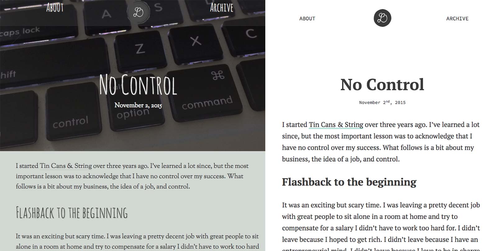
version 1 and version 2 comparision
My process was far from my typical workflow. A workflow that has changed since I created version one. I started with my goals, found a suitable typeface, and the rest was history.
My main goals with the new version:
- Readability
- Simplify
- Post more often
Readability
First I started with type. I find myself doing this more and more now and most designs I work on start here. This is a blog after all, if you can’t read it what’s the point?
Choosing Typefaces
My type choices the first time around were based on purely on style and Sorts Mill Goudy and Amatic SC fit the bill. This time around I wanted to prioritize readability and quality. I was browsing Typekit and various foundries for a good serif when I took a brief look at good ol’ Google Fonts. PT Serif popped up in the serif filter. I had recently worked on a project that used the sans face and I remember thinking that the serif was a nice choice so I explored it a bit more. (By the way the PT family is also on Typekit).
PT Serif is readable and has a dash of uniqueness. I thew it into Typecast, played around with the scale, line height, and font size with some help and settled on something I liked. I didn’t spend a lot of time here, but established a solid foundation. The base font size has been bumped up from 20 to 23 pixels this time around allowing for less characters per line. I think we’re somewhere around 65 to 70 at max width.
Source Code Pro came about because I found myself wanting a sans for smaller type, plus it can pull double duty when I need a monospace for code blocks. I also like that fact that I’m sprinkling in a dash of dev style.
Contrast
The contrast of the site wasn’t too bad, but that’s improved on the new version. They both passed the test, but I like how images and color show up against a white background.
Simplify
Overall I wanted less clutter. Less clutter when making a post and less clutter on the front end while reading.
Banner Images
I have a love hate relationship with banner images for posts. If they add value and are needed that’s great, but I don’t want to have to come up with an image just to make the post. Now I no longer need an image, but I can have one if I’d like.
Logo
I simplified the logo slightly. It doesn’t really look much like a tree anymore because the “rings” are gone, but it was a quick fix to remove them so it’s more readable at it’s now smaller size.
Grid
I read somewhere that the best grid is max-with and it’s kinda true for sites like this. I’m not using any sort of grid this time around. I have a container for my content with a max width to keep my characters per line in check. Certain images break out of this container using this trick.
Post More Often
I’m hoping my attempts at simplifying and having a design I like again will inspire me to post more often. I enjoy the idea of writing, but am not very good at it or finding the time it takes to get the words out. My goal with this site was and still is to post anything from personal thoughts about life and web design so I hope to do that more often from here out.
Considerations
I’ve been using the classic version of iA Writer for quite some time for writing anything from to do lists, to blog posts, to email drafts. I recently upgraded to their latest version and there are some features that may allow me to write everything in Markdown now.
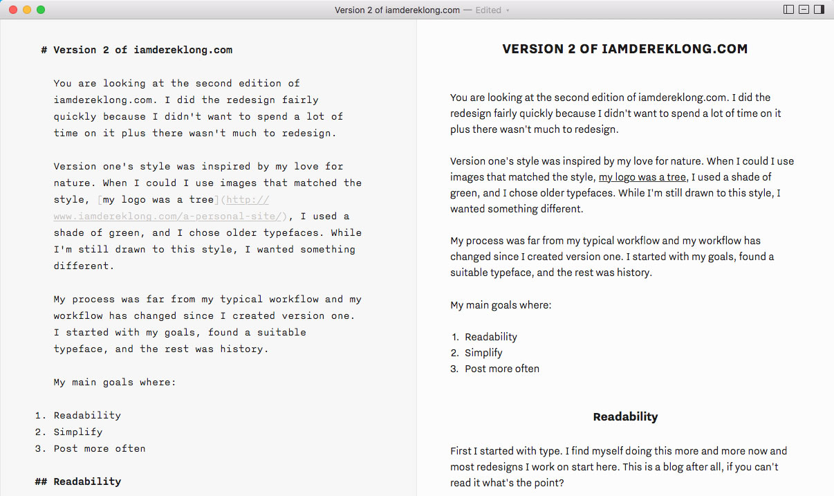
split screen view of markdown and formatted html in iA Writer
I’m writing this post there and I guess I’ll just export the html into WordPress, which works but ever since I read Trent Walton’s thoughts on Jekyll it got me excited not only about writing purely in markdown for posts but the simplicity of a static site. I love the simplicity, and perhaps the nostalgia, that a static site brings. However I decided to stick with WordPress as I don’t want a new technology to get in my way right now.
I strongly considered using these thoughts on responsive typography. I think it’s a great idea and it may be a part of my work someday, but again for now I chose to stick with something quick and familiar for the sake of time.
With this new, simplified layout I may make some art directed posts. Perhaps changing some background or text colors here and there, nothing too crazy.
It’s worth noting that the new version likely has less personality than the old site, which is okay with me. I’ll admit that this version probably looks like 99% of the other blog sites out there but with my goals in mind I felt this design was a nice solution. In the end I wanted to build the kind of site I would like to read.
See any issues or ways to improve? Would love your feedback!